RepConnect
Connect. Empower. Inform.
Overview
As part of the Google User Experience Design Certification course, I developed an app to help US citizens easily identify their state and federal government representatives.
Timeline
Five Months
Platform
Figma
Role
UX/UI Designer
UX Researcher
Challenge
The idea for RepConnect stemmed from a passion for activism and frustration at the unnecessarily complicated process of finding and connecting with my elected representatives. While resources are available for finding elected officials, many are not intuitive and often require users to navigate multiple platforms, which can be frustrating and time-consuming.
For those passionate about civic engagement, politics, or activism, having an effortless, seamless way to connect with their representatives and stay informed on US politics is essential.
“How Might We…”
…enable citizens to easily find and connect with their representatives, while staying informed about US politics on a single, user-friendly platform?
Solution
The project aimed to empower citizens by creating a straightforward platform for discovering and contacting their elected officials. By streamlining these interactions, the goal was to foster increased civic engagement and communication.
Research Goals
Research Methods
Survey
I sent out a survey to gain insight into:
- What prompts a user to contact their elected officials
- Hurdles a user faces in the process
- Existing resources users typically use
“What are some challenges you've faced in the past when trying to figure out who your political representatives are?”
User Interviews
I conducted a few user interviews where I asked the same questions from the survey.
Insights
I started by gathering all my data and then created empathy maps. First, I made an empathy map for one interview participant, and then I created an aggregated empathy map to compile all the user research information.
After analyzing the survey responses and interview notes, I discovered some common themes:
Users often struggled with confusion when searching for their representatives and finding contact information.
Users found it challenging to read their representatives' political biographies due to complex vocabulary. They had difficulty digesting the information and extracting the key points they were interested in amid the jargon.
Empathy Map
“I want to find out who’s representing me so I can know who to contact about social issues.”
— Participant
User Persona
Ginny is a passionate activist who needs access to easy-to-digest information on her government representatives which also enables her to contact them because she wants to be able to voice her concerns and opinions.
Competitive Audit
Objective
Compare the effectiveness of each competitor’s site in providing accessible information on state and federal government representatives for both new and returning users
Procedure
First Impressions
Desktop Experience
Mobile Experience
Website Interaction
Features
Accessibility
User Flow
Navigation
Website Visual Design
Brand Identity
Tone
Descriptiveness
Website Content
Tone
Descriptiveness
Companies
Causes (formerly Countable)
iCitizen
Vote411
Paper First
I designed wireframes with a user-friendly interface with improved navigation, featuring a news feed on the home screen that combines a traditional newspaper look with a digital twist for added fun.
I made several versions of the home screen, marking the elements I wanted to include in the final version with a yellow star.
Paper to Digital
As I transitioned from paper to digital wireframes I noticed some issues: there were a few screens that needed revamping.
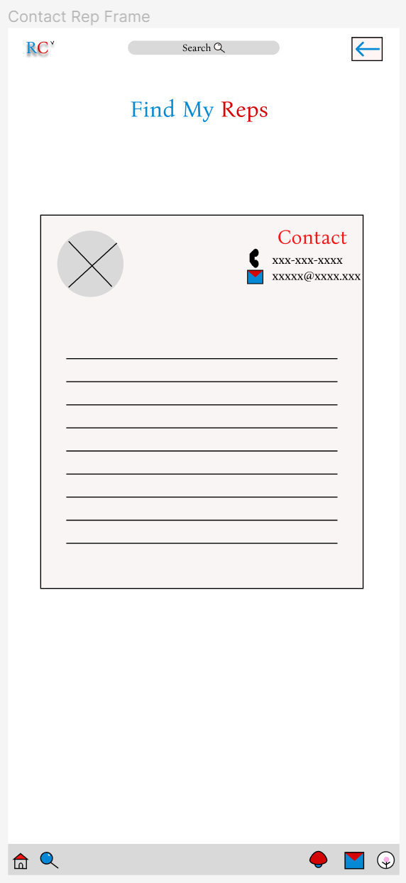
Rep Info Cards Redesign 1.0
Challenge:
The initial design for the Rep Info screen was outdated and desperately needed modernization. Initially, I envisioned a large biography section and attempted to design it to resemble a business card. However, it ended up looking more like a letter format.
Version 2.0:
Replaced plain text contact details with intuitive buttons for contacting the representative.
Shortened the biography to a brief blurb and added a button linking to the representative's website for more detailed information.
Direct Message Redesign
Challenge:
The direct messaging feature and interface was giving very early internet 2000s. I knew it needed some freshening.
Version 2.0:
Designed with inspiration from iMessage and Instagram DMs.
Incorporating familiar design elements provides a sense of familiarity and ease of use.
Low Fidelity Prototype
| User Flow |
Homepage Navigation: Users start on the app's homepage and select the "Find My Reps" tab from the toolbar.
Enter Zip Code: After entering their zip code, users are directed to a page displaying their representatives.
Direct Message: Users can select a representative and message them directly through the app.
Usability Testing
Part I
Insights:
The toolbar was not easily locatable, causing confusion among participants.
The original sidebar design for the toolbar felt awkward and was difficult for users to find and use.
Additional Insights:
I thought adding a chevron by the RC logo would indicate its interactivity, inspired by Instagram's clickable logo. However, users did not find this as intuitive as expected.
Many users looked for the toolbar in the bottom navigation bar, reinforcing the need for a more universally recognized navigation icon.
Design Iterations 1.0:
Redesigned the toolbar to appear as an overlay instead of a sidebar, making it more accessible and visible.
I considered relocating the toolbar to the search icon but wasn't satisfied with this approach due to potential user confusion and the risk of overcrowding the bottom navigation bar.
Solution:
Implemented universal icon for navigation—the three horizontal lines (AKA "hamburger menu").
Toolbar Redesign
Rep Info Cards Redesign 2.0
The usability study provided positive feedback on the ease and intuitiveness of the contact buttons. However, I was still unsatisfied with the overall aesthetic of the 2.0 version.
Version 3.0:
Revised the layout to be more compact and rectangular, resembling a business card.
Switched from square to rounded "pill buttons" for a more modern and sleek appearance.
Challenge:
The 'newspaper' format I had envisioned felt disconnected and outdated within the interface.
Inspiration:
I drew inspiration from well-established designs like Apple News, which achieve unity and variety through a mix of square and rectangular shapes for news articles, creating a visually appealing layout.
Solution:
I added a horizontal scrolling carousel of top stories at the top of the page. Below, news articles were arranged in a grid with a mix of squares and a single rectangle for visual variety.
Home Screen Redesign
High Fidelity Prototype 1.0
Usability Testing
Part II
Insights:
Users universally found the app's features easy to use and understand.
Users liked the familiar design of the messaging interface.
Users suggested adding tutorials or more text guidance for new users.
Additional:
I had one new participant for my second usability study-- who had never seen the app or used it before. They pointed out that the representative cards on the Representative List screen didn't appear interactive, and they didn’t realize they could click on it.
Solution:
Implemented a “?” icon tooltip button with tooltips to explain functionality through an overlay
Home Screen
Representative List Screen
Created card variants that darken on hover or press and applied the same effect to some buttons on the app.
Additional Tweaks:
Scaled up the cards for representatives, making them larger and increasing the text size for better readability.
Enhanced the toolbar with a stroke and light grey fill for better contrast and readability by increasing text weight.
Centered the zip code bar to reduce negative space and bolded the text for prominence against the minimalistic background.
Before
After
High Fidelity Prototype 2.0
Final Design :)
Impact
Participants consistently praised the app for its intuitive and user-friendly interface. Their positive feedback highlighted the effectiveness of my design approach in meeting user needs and improving overall usability.
What I Learned
Throughout this project, I gained a thorough understanding of user-centered design and iterative prototyping. Extensive user research provided valuable insights into the various needs and challenges users encounter with political engagement apps. Continuously refining prototypes based on user feedback highlighted the importance of flexibility and adaptability in creating effective designs.
“I would definitely download or use very often because I like how straightforward it is, I feel like I could recommend [this app] to anyone who’s on any platform of technology and that they’d be able to understand and use it as well!”


